The world of website design is always changing as technology improves. Design trends move quickly based on what works best for users. As we head into 2024, it’s important for website designers and businesses to pay attention to the latest design styles. This will keep their websites looking good, easy to use, and attractive to visitors.
We want to take you on a tour of important website design trends for next year. We’ll look at different techniques and styles that are reshaping how websites look online. These trends will help you create sites that not only look great, but also connect with users in a meaningful way. From fonts to 3D graphics to seamless interactions, our tour will cover a wide range of trends shaping website design.
By learning about and using these trends in your own work, you’ll be ahead of the curve. Your websites will stand out from others. Whether you are starting out as a website designer or running a business with an online presence, these trends will guide you toward your goals.
Let’s start our exciting journey together and uncover the top 15 essential website design trends for 2024. You’ll leave feeling inspired, interested, and prepared to take your skills to new heights. Website design is always evolving – now you’ll be ready to evolve with it!
Typography
Font choices are very important for website design. Like the soul of a website, fonts bring visuals and words together in an artistic way. Font design goes beyond just letters – it’s how you arrange different fonts, styles, and types of fonts to share information and make people feel something. As we look at website design trends for 2024, fonts will play an even more creative and original role in making digital spaces come alive.
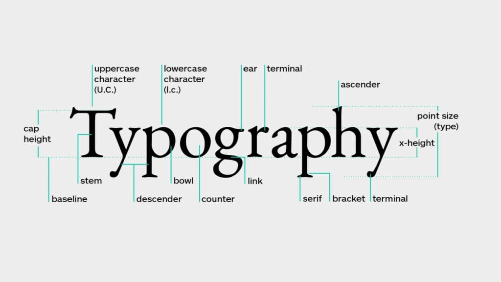
Today’s online world has a lot of information to share. Designers face making all that content look good and easy to use. This is where customizing and experimenting with different fonts comes in. Designers aren’t limited to standard fonts anymore. They can choose unique fonts or even make their own styles of letters. This gives websites their own personality that fits the brand’s message and values.
The right font choice has power to completely change a website’s vibe. It can make a website unforgettable with a lasting impression on visitors. For stores online, font style is even more important as it helps create the brand identity and affect what customers think. Each font used should match the brand values and appeal to their target audience. Font designs should improve readability, keep everything looking cohesive, and balance text with other design elements.
So in 2024 website design, fonts won’t be an afterthought. They will really shape the whole feel of a website, giving it personality and capturing people’s attention. The right fonts will help websites come to life.
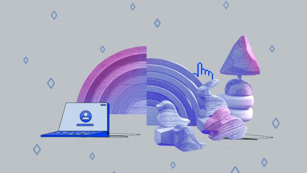
3D Design
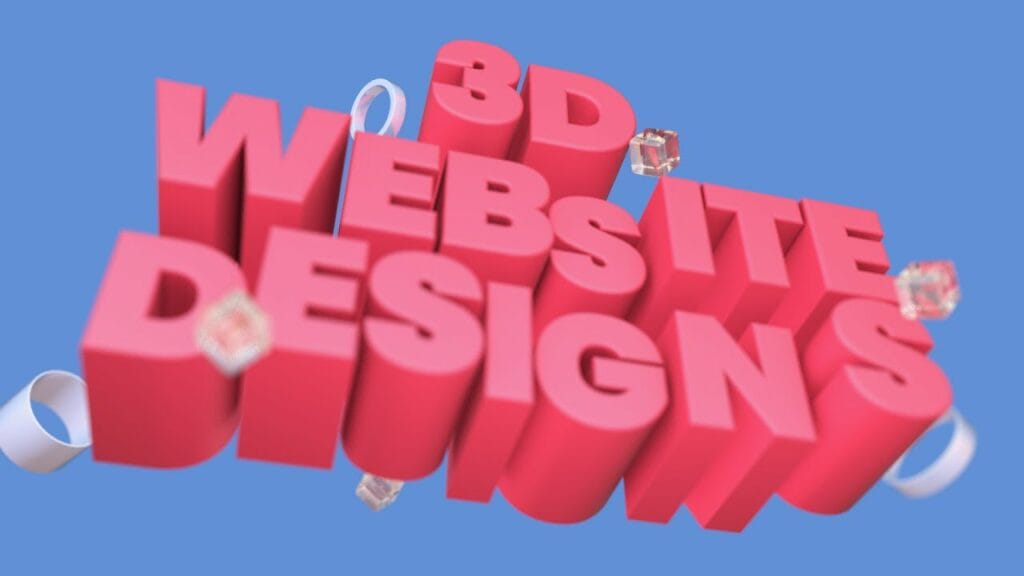
Step into the amazing world of website design where 3D elements have become very popular for designers. In 2024, 3D wonders will be a top choice for adding depth, interaction, and wonder to sites.
When designers add 3D visuals, their creations really come alive. It’s like the sites jump off the page and grab people’s attention in a memorable way. By including 3D objects, fun animations, and cool effects, they unlock a whole new level of realism and ways for people to engage. Believe me, once you see 3D in action it’s hard to look away!
Best of all, it’s now easier than ever for designers to use 3D. They have lots of tools, platforms, and pre-built options at their fingertips. It’s like they have a secret toolbox making 3D simple to add. The possibilities are endless. This new ease encourages designers to think outside the box and push their imagination. The result is an experience like no other, taking users on an unforgettable virtual journey.
For example, you may see abstract 3D art as the main focus or dynamic 3D animations that bring a site to life. By embracing 3D, designers give their sites a modern, stylish look that leaves a lasting impression. It not only makes sites look great but also boosts how people interact with the content.
Get ready for a journey where dimensions combine, interaction flows, and the impossible becomes real. Welcome to the world of 3D design, where online experiences go beyond ordinary, captivating visitors again and again.
AR and VR
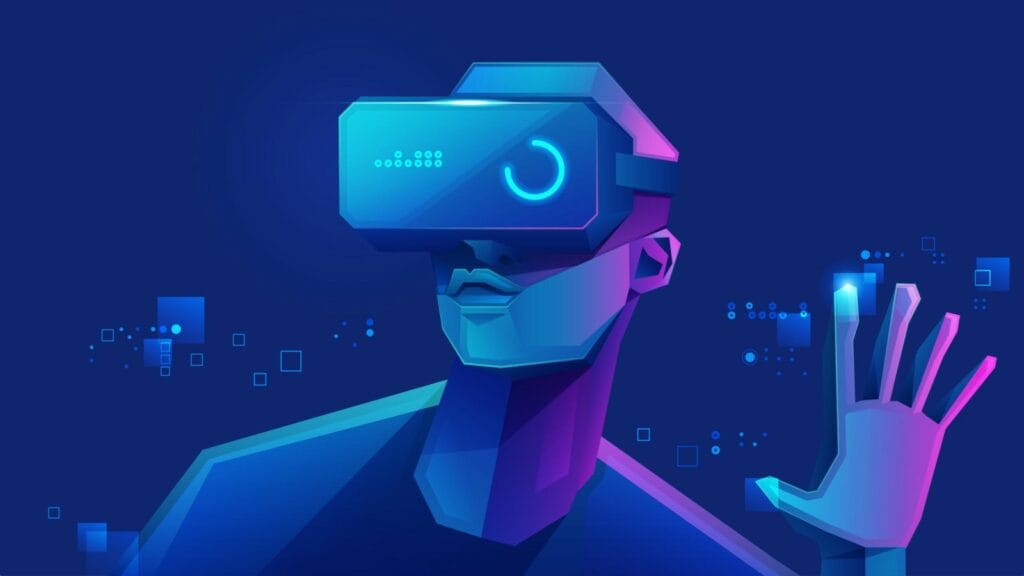
In 2024, website designers are excited to use augmented reality (AR) and virtual reality (VR) tools. These breakthrough technologies have changed how users interact with websites in amazing ways.
Augmented reality smoothly adds virtual things into the real world. It enhances what users see around them. Virtual reality creates a fully digital world for users to explore and take part in. Both AR and VR are now very helpful for website designers, especially for online shopping sites.
Gaining customers’ trust is one of the biggest challenges for online stores. However, AR and VR have come up as great solutions. By adding AR and VR experiences, online shopping platforms effectively close the gap between virtual shopping and real shopping in person. Users can now vividly see and actively engage with products in a very hands-on way. This leads to stronger confidence and better choices when buying.
Imagining being able to virtually try on clothes before buying. Or see how a piece of furniture would look in your living room. AR and VR let users do just that, providing convenience and assurance lacking in regular online shopping.
Also, these technologies are more than just seeing products. They create an exciting interactive environment to explore features, interact with virtual pieces, and deeply understand options. By immersing users in these experiences, AR and VR make memorable connections that leave a lasting impression and build trust between the brand and customer.
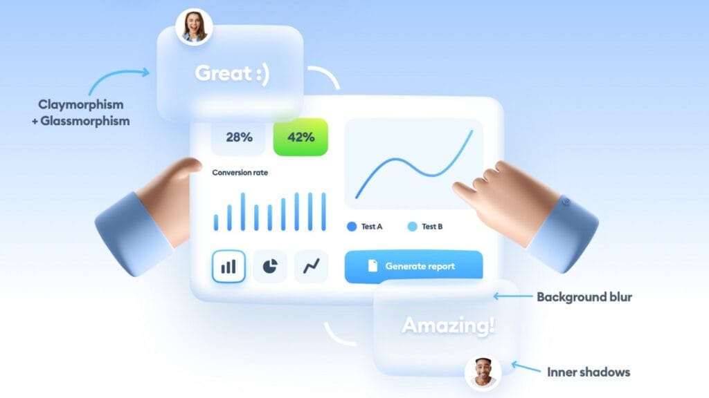
Glassmorphism
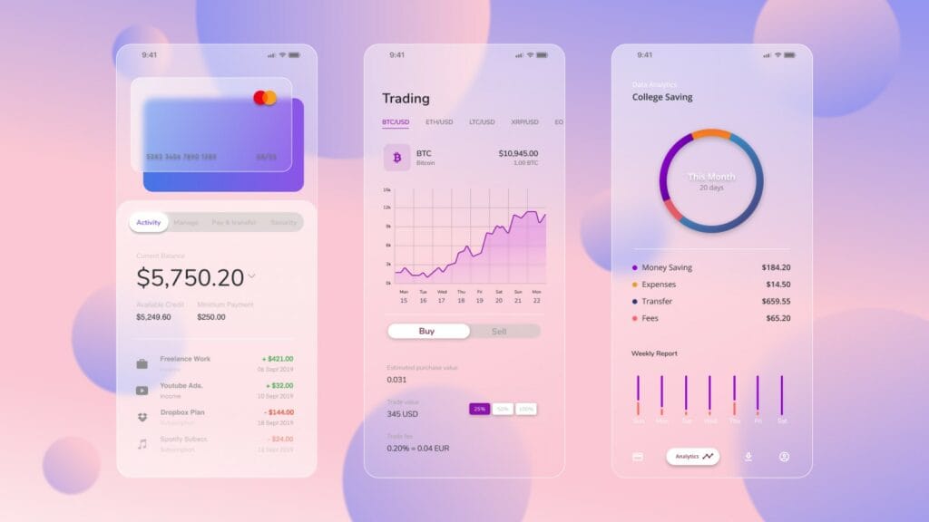
Glassmorphism is a popular website design trend that uses blurred glass-like elements. It adds texture, depth, and sophistication to sites. This style combines transparency, fuzziness, and bold colors to make visually pleasing and modern layouts.
The frosted glass effect, like see-through glass panels, creates the background. It makes the design stand out in a unique way. The blurred pieces in glassmorphism not only look good but also help with readability. By blurring the background slightly, the front content pops out more and is easier to read, ensuring a smooth user experience.
As we move into 2024, glassmorphism remains a favorite among website designers. Its ability to beautifully blend color, texture, and clarity makes it work well across different types of sites. Whether it’s a corporate site, online store, or portfolio, glassmorphism lends elegance and contemporary flair.
This trend also fits well with the overall minimalist principles popular in recent web design. Its sleek, clean look combined with subtle animations and gradients creates an aesthetic that is attractive and user-friendly.
As design evolves, glassmorphism proves to be a lasting trend that skillfully merges appearance and functionality. Its ongoing popularity in 2024 shows how effective it is at generating engaging and modern interfaces. By embracing glassmorphism, designers can take their sites to new heights and provide striking experiences for users.
Interactions & Animations
In web design, keeping users engaged is extremely important. This is where interactions and animations come in handy. These dynamic elements not only make websites more eye-catching, but also boost how much people interact.
Interactions and animations are great tools for creating personalized experiences, especially for stores trying to get sales with short attention spans. By adding micro-interactions and animations, designers can make their sites more interactive and fun, better capturing and holding users’ attention.
Small hover effects or confetti popping when a button is clicked have big potential to create a more engaging experience. They provide immediate feedback, making the website responsive and lively. These minor yet meaningful interactions strengthen the connection between user and site, raising satisfaction and encouraging exploration.
Animations can also smoothly guide users through the site. Smooth transitions between pages or scrolling that slowly reveals content in exciting ways makes browsing feel easy and enjoyable. These animation techniques not only make the design look elegant but serve a useful purpose in improving usability.
The variety of effective interaction and animation options is truly amazing. From subtle fade-ins and slide-outs to dynamic parallax scrolling and animated illustrations, the possibilities are endless. The key is balancing visual appeal with usability, ensuring interactions and animations enhance the experience rather than overshadow the content.
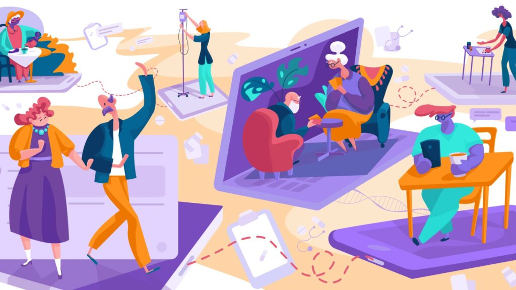
Custom Illustrations
In the constantly changing world of web design, using custom illustrations is gaining popularity. These unique visuals add personality and realness to websites, making them stand out from the crowd.
Custom illustrations provide a fresh take, moving away from stock photos and generic graphics. They let designers express their artistic style and put their own touch into the site’s look and feel. This births a visual identity that is completely unique to the brand. With custom illustrations, sites can create a distinguishing and memorable presence online.
One big benefit is how custom illustrations easily connect the brand to its audience. These visuals bring up emotions, tell compelling stories, and convey brand values in a relatable way. Whether through whimsical characters, lively scenes, or intricate details, custom illustrations catch attention, engage users, and leave a lasting impact.
Additionally, custom illustrations play an important role in attracting and holding users. They provide an exciting and visually stimulating experience, making websites more welcoming and fun to explore. Illustrations can also be tailored to specific target audiences, allowing brands to personally connect with users on a deeper level.
Design-wise, custom illustrations offer flexibility with style, color palette, and overall aesthetic. They integrate smoothly across sites, from intro banners to product displays to story elements. By skillfully using illustrations, designers can craft a consistent, visually pleasing user journey.
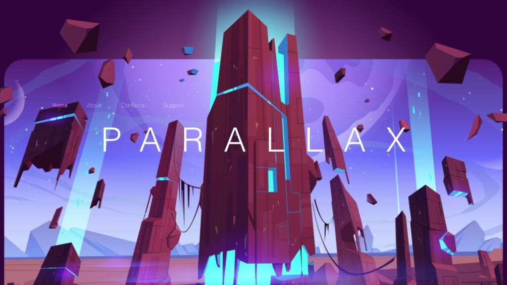
Parallax Scrolling
In web design, parallax scrolling is a popular technique for creating engaging, interactive experiences. This clever approach involves moving background and foreground pages at different speeds. The result is a visual depth that catches people’s attention and makes the overall design more appealing.
Done well, parallax scrolling has power to fully immerse users in the site. As people smoothly scroll, distinct design layers move separately, forming a breathtaking layered look with interactive movement. This dynamic interplay adds excitement and keeps users engaged, drawing them further into exploring.
Parallax scrolling lets designers skillfully guide users through content in creative, hands-on ways. By expertly moving elements, they can smoothly unfold the narrative, highlighting important info and showcase key visuals gracefully and precisely.
One benefit is making a memorable first impression. Sites using parallax scrolling on their intro sections can instantly grab attention and leave a lasting impact on visitors. Incorporating eye-catching animations make the initial scroll an enjoyable experience setting the tone.
Many sites effectively use parallax scrolling to improve experiences. A travel site may employ it to simulate moving through landscapes, allowing users to explore destinations as they scroll. Likewise, an online store could showcase product features or provide interactive demos with parallax scrolling.
Gradients
Gradients have naturally become part of modern web design, adding liveliness and movement to site aesthetics. They play an important role in enhancing visual appeal and creating engaging user experiences.
Gradients, made from smoothly blending two or more colors, offer designers chances to explore new color combos and produce exciting visual effects. By using gradients, sites can achieve a sense of depth, dimension, and energy not possible with flat colors alone.
Gradients are popular for their ability to bring up different emotions and moods. Bold, vibrant ones spark excitement and playfulness, while subtle ones cultivate a calm, soothing feel. Designers have flexibility to choose styles matching the site’s purpose and audience.
As we move into 2024, using soft pastel tones and gentle gradients remains strong. Pastel gradients, with their delicate shades, give websites a sophisticated yet modern look that appeals to many. They exude elegance and subtlety for a visually pleasing and inviting design.
When applied strategically, gradients guide users, highlight important parts, and enable smooth visual journeys. They integrate smoothly into backgrounds, buttons, text, and more, letting designers infuse depth and appeal throughout the site.
Claymorphism
Claymorphism is a popular new website design trend. It brings a fun, creative vibe through elements inspired by clay and sculpting.
In claymorphism, design pieces and interfaces resemble clay models or sculptures. Soft edges, rounded corners, and a mix of 2D and 3D images create a unique look. This style adds charm and imagination to sites, making them stand out.
Vibrant, bold color palettes are key. Bright, lively shades evoke energy and playfulness. However, balance is important. Too many colors can overwhelm and distract users from content. Designers must carefully select colors that complement each other for a cohesive look.
Visual hierarchy is also important. While playful design adds personality, information must be clearly organized for users. Things like buttons, menus, important content need to be easily seen and accessed.
Claymorphism offers an innovative approach, appealing to users seeking engaging, interactive experiences. By including clay touches, sites can foster familiarity and fun that resonates with visitors. It delivers a fresh, modern vibe through creativity and color.
Memphis Design
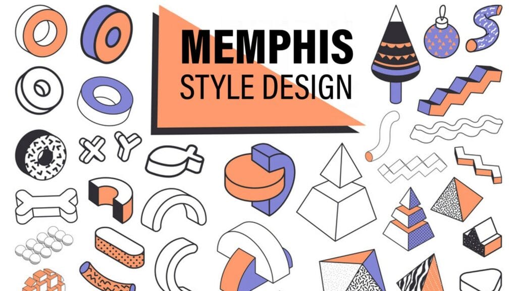
The Memphis Design style from the 1980s is making a comeback in website design for 2024. This bold, vibrant look has caught designers’ eyes again, adding nostalgia and dramatic visual appeal to sites.
Memphis Design uses contrasting colors, abstract shapes, and unique patterns. It embraces a playful, unconventional method, breaking from standard norms. Bright, eye-catching shades create energy and excitement.
Sites using Memphis inspiration stand out in the digital space. Vibrant colors and abstract elements bring drama and uniqueness. Users see a captivating, memorable visual experience.
Memphis Design’s resurgence in 2024 shows its timeless nature. Designers value how it evokes nostalgia with a modern twist. Contrasting color schemes and shapes generate dynamic, stimulating atmospheres, motivating exploration.
Through bold geometric prints, fun typography, or unexpected color mixes, Memphis Design offers an original, exciting method. It attracts those seeking change from ordinary looks and wanting design sparking joy and interest.
Voice-Activated Interface
Voice-controlled websites are becoming more popular in web design. As voice assistants and voice searching grow, designers recognize adding these features enhances the user experience.
Voice searching is now a daily activity for many. Instead of typing, people simply speak what they want. This affects design as users want sites supporting voice navigation and interaction easily and efficiently.
Including voice controls brings some clear benefits. First, it improves accessibility for people with disabilities or those preferring voice. Voice commands allow hands-free browsing, helping anyone with limited mobility or vision issues.
It also meets changing user preferences. People enjoy the convenience and speed of voice searching, so expect websites to keep up. Voice functionality provides a smoother, easier way to find info or do tasks.
For businesses, voice features can boost customer engagement and satisfaction too. Voice interactions feel more natural and personalized, building stronger user-brand bonds. Voice searching may also raise website discoverability as search engines prioritize optimized voice content.
The rise of voice technology is transforming how people communicate with sites. Designers adding voice-activated options meet rising expectations and deliver better experiences for all.
Accessibility and Inclusivity
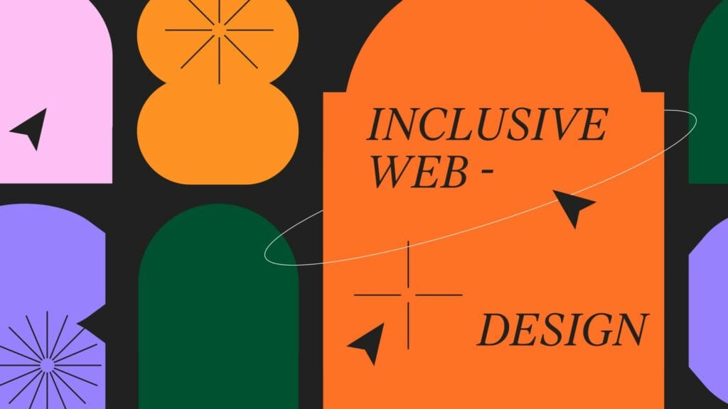
In today’s digital world, web design must focus on accessibility and inclusiveness. Sites should serve all users, no matter their abilities or disabilities. Growing awareness shows the importance of inclusive practices giving everyone equal access to information and services.
Accessibility in design means creating sites usable by those with disabilities. This includes visual, hearing, motor, and cognitive impairments. Following accessible guidelines lets individuals with disabilities easily navigate, interact with, and engage site content.
Inclusiveness goes beyond accessibility to reach more people. It considers diverse needs and preferences of users. This involves factors like language, culture, different literacy levels. Embracing inclusiveness ensures sites are accessible and welcoming to all, no matter backgrounds or abilities.
Several key accessibility elements and techniques help designers achieve inclusive sites. These include image descriptions, proper color contrast, clear language, keyboard navigation, closed captions. Implementing these removes barriers for an inclusive, user-friendly experience for all visitors.
Thumb-Friendly Mobile Navigation
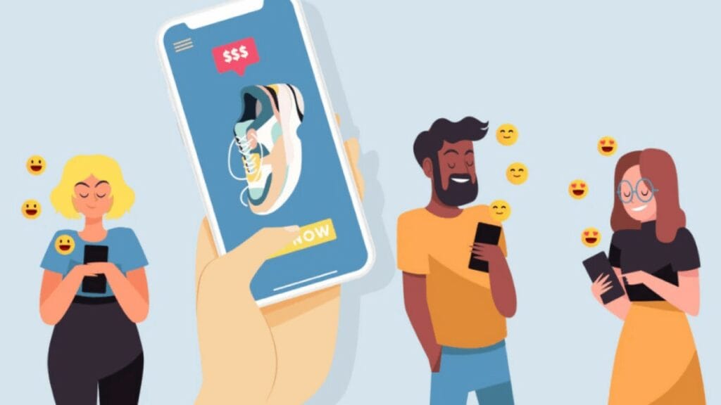
In today’s mobile-focused world, web designers must make navigation easy for thumbs. With more people using sites on phones, creating comfortable mobile experiences is key. The goal is intuitive, user-friendly navigation accessible by just the thumb.
Thumb-friendly design considers how we hold phones. Our fingers wrap around back, leaving the thumb to do most screen work. Placing elements within thumb’s reach provides seamless, natural usability.
Several techniques prioritize thumb ease. One approach positions navigation bars or menus at screen bottom center, easily reachable by thumb. This lets users navigate without stretching or straining fingers.
Another uses thumb gestures like swipes or single taps, replacing buttons or links. Simple thumb movements allow smooth navigation through sections.
Apps like Instagram and Twitter exemplify this well. Bottom bars let accessing core features effortlessly by thumb. They also integrate swipes for scrolling or changing screens, resulting in thumb-focused experiences.
Focusing design for thumbs keeps navigation natural and comfortable for mobile users. Simple gestures and strategic placement optimize usability on small touchscreens.
Smart Video
In web design, video content is a powerful tool for engaging users and sharing messages. But it’s not about adding any random clip. The key is purposeful, well-planned video enhancing the experience. This is where smart video integration helps.
Smart video goes beyond just adding videos to pages. Careful planning ensures clips align with site goals and interest target users. Designers can captivate and involve people more while clearly explaining through smart techniques.
One big benefit is higher engagement. When done thoughtfully, videos grab attention better than photos or text alone. They tell stories concisely and immersively. Strategic placement within the layout also helps.
For example, a travel agency’s homepage might feature a smart clip showcasing breathtaking destinations. This inspires and connects emotionally with potential customers, motivating them to learn more and inquire about services.
Smart video isn’t limited to promotions. Designers can use it for tutorials, customer testimonials, even customized messages. The goal is harnessing video’s power to effectively communicate, spark emotions, and encourage target actions.
Sites like Apple and Nike expertly apply smart video for memorable, compelling campaigns that greatly engage visitors. Through strategic clips, they craft dynamic, interactive experiences well-matched to their audiences.
Conclusion
Website design is always changing, so keeping up to date is important. The top 14 trends for 2024 offer creative ways to improve sites.
Trends like unique illustrations, 3D effects, augmented reality and more provide opportunities to explore new techniques. Interactive elements, gradients, playful clay designs, nostalgic Memphis style, and others help craft memorable experiences.
Both form and function trends help, from easy-to-use mobile layouts to accessible designs for all. Video, voice control, and smooth scrolling enhance user engagement too.
Applying trends thoughtfully fits each brand’s identity and goals. It boosts visual appeal and usability while increasing understanding and traffic. The right trends personalized strengthen user connection and product interest.
Web design continuously evolves. By testing these ideas and adding favored trends, creators can build attractive, intuitive sites that leave lasting positive impressions. Creativity and new approaches will keep audiences engaged in the exciting changes ahead. Staying open to each year’s developments helps sites succeed.
Elevate Your Digital Presence with Opza
The changing digital world challenges businesses to adjust, try new things, and get noticed. With styles and experiences evolving, is your site ready for 2024?
Want to surf the new trends in website design? Talk to Opza’s expert designers based in Dubai. Whether local or global, our team turns ideas into beautiful, useful sites.
From the subtle nuances of contemporary aesthetics to the power-packed functionalities of tomorrow, we’ve got you covered. Explore our web design services in Dubai and ensure your website stands out, connects meaningfully, and delivers results in 2024 and beyond.


